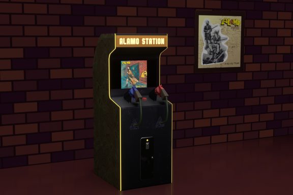
Like all good things, the idea of this project came spontaneously. And the project itself was originally purely utilitarian. I needed two pictures that would clearly illustrate the mixing and mastering services that I provide in my music studio. But, as the idea developed and comprehended, the project became more complex and layered, overgrown with new conceptual meanings. If you follow my work, you probably know that over the past year and a half I have become seriously interested in 3d modeling. Music has not faded into the background and is still my main source of inspiration. However, we must admit that today the language of visuality often sounds much louder than the language of music. Cultural codes and meanings embedded in music can be complemented and amplified many times with the help of a suitable visual series. In part, the incentive for bringing this project to life was my desire to broadcast my vision of the surrounding reality to the world through Flame2Fame music. And also, my “unique ability” to complicate things.
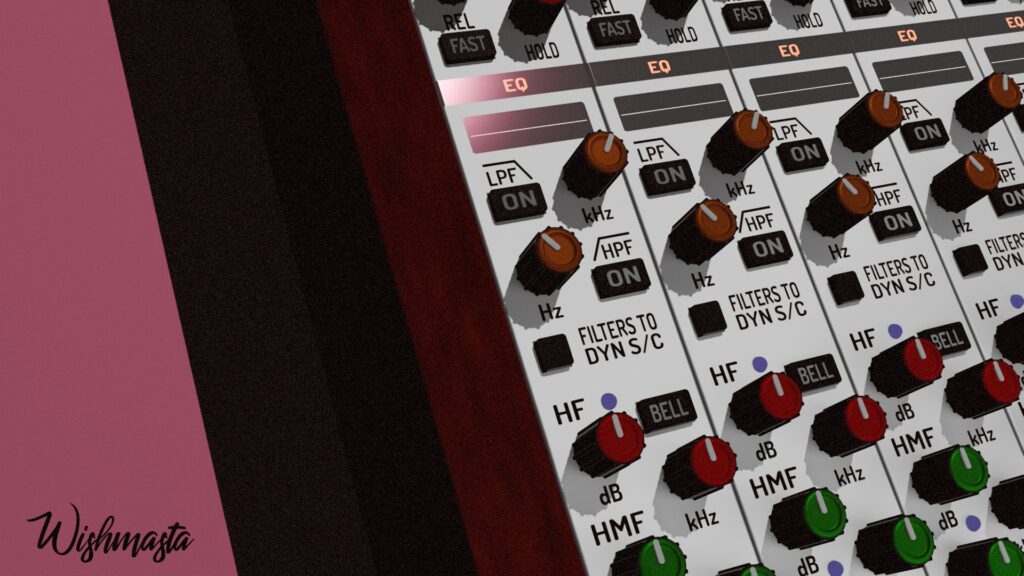
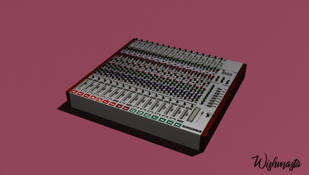
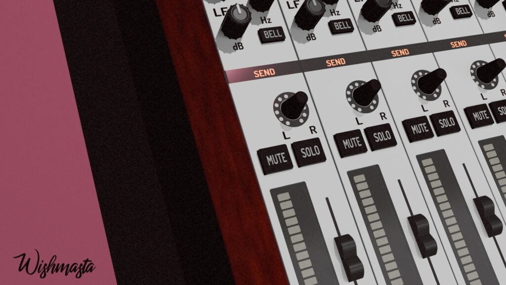
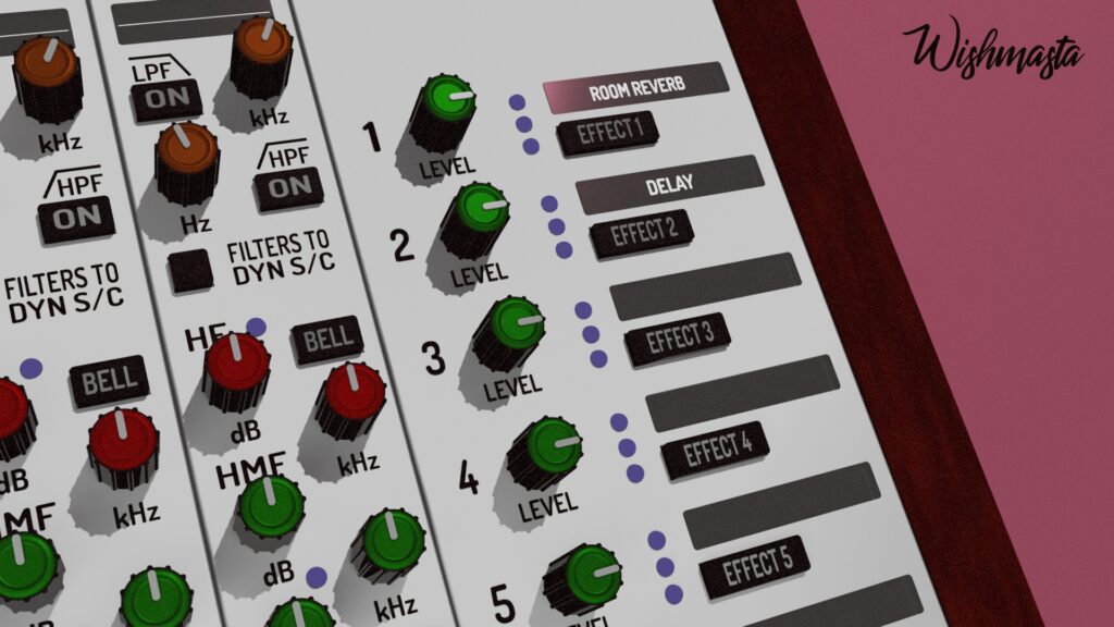
Anyone who has ever written music in the Reason program will immediately recognize the familiar elements of the Reason mixer in this audio interface. Yes, you are not mistaken! It’s him! More precisely, this is what it could look like, being a real “iron” device. When I first started writing music, in the mid-noughties, computers were already becoming a major component of many music studios and a tool of beatmakers. While some enthusiastically talked about new technologies that make music creation more accessible, others breathlessly discussed the iconic samplers and synthesizers of the “Golden Era of Hip-hop.” At that time, Dr. Dre and 2PAC, Nas and Rakim, Ice Cube and Nate Dogg, LL Gool J and Wu-Tang Clan, DMX and Ja Rule were playing in my player. Therefore, we can say that I was more of the latter than the former. But I wanted to write music, and at that time I simply did not have the opportunity to buy an expensive vintage sampler or synthesizer. From here, it’s easy to guess why my choice as the main DAW fell on Reason. After all, the creators of Reason shared my love for analog musical instruments and processing effects. This has become part of their philosophy, embodied in the digital workstation. As for me, the choice I made back then had a significant impact on the sound of my music in general. Even today, after so many years, I often use Reason or Reason Rack Plugin when I need to come up with a unique instrument sound or assemble an unusual chain of processing effects. This DAW has become for me the very “hardware” that makes me sound the way I sound.
If you look at the covers of the hip-hop albums of the “Golden Era”, you will most likely immediately notice the minimalism and “imperfect” graphics, and the tonal color fill. You’ll see a rapper with a microphone or a boombox, or a DJ with a sampler or vinyl deck. Most of the covers look rough and handmade, but at least they’re “real.” It’s precisely this character that I tried to convey in this project. Not a digital triumph of color and form, but a rough, analog stylization. The image is grainy, as if shot on film. Deep, flat shadows create a dramatic contrast between the digital mixer and the dusty red background. What you see is not meant to represent an object from real life (we have already agreed with you that it is a symbol), but to set a certain mood and evoke associations with elements of the musical aesthetics of old-school hip-hop that you already know. At the center of the composition is a mixer, which serves as a link between the human being and the music they create with this device. The “dusty” quality of the image can be compared to the imperfect, “gritty” sound of analog samplers. The rhythmic repetition of the mixer’s knobs and faders lends the mixer itself a “monumental” and “significant” quality. These seem to be real controls that allow one to alter the device’s parameters, not mere conventions.
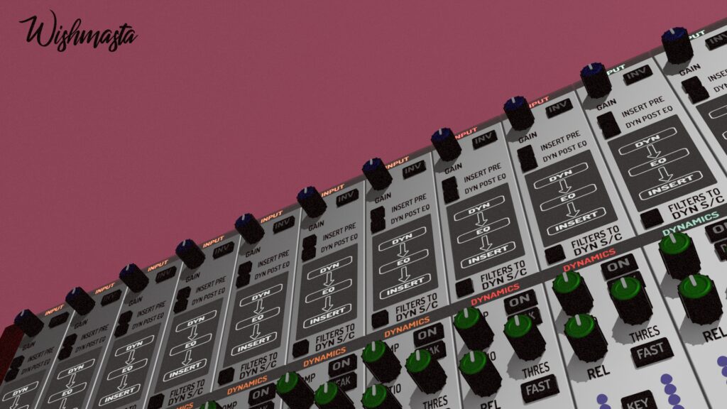
There is another level of meaning that was originally laid down in this work, which I want to tell you about. While most teenagers grew up watching Disney animation, Japanese anime films and TV series were absolute favorites in my childhood. Already at a more mature age, I came to the conclusion that the philosophy and aesthetics of the Land of the Rising Sun are close to me. This project is a direct quotation from the aesthetics of Akira: here technocratic minimalism meets the cold palette characteristic of the original source and the emphasis on the materiality of metal. The world of high technology and low living standards is exactly how the modern reality I find myself in feels. The reality is that people have expensive smartphones, but they don’t always have food in the fridge. The red color stands for energy, life, struggle, aggression, and the cold white-gray metal stands for an emotionless machine that performs its function and can be both an assistant and a hindrance. According to critics, Neo-Tokyo in “Akira” is a full-fledged acting character. His endless highways, winding labyrinths of slums and cold skyscrapers dictate the conditions of survival for the rest of the anime characters and shape their character. Here you can draw a direct parallel with my project and say that it is similar to how samplers from Akai or drum machines from Roland defined the sound of beatmakers of the 80s and 90s. Actually, this is the reason for the departure from anthropocentricity in this work and the shift in emphasis towards the iron structure.